Cards XI alternatives and similar libraries
Based on the "Transition" category.
Alternatively, view Cards XI alternatives based on common mentions on social networks and blogs.
-
-
TLYShyNavBar
DISCONTINUED. Unlike all those arrogant UINavigationBar, this one is shy and humble! Easily create auto-scrolling navigation bars! -
StarWars.iOS
This component implements transition animation to crumble view-controller into tiny pieces. -
BubbleTransition
A custom modal transition that presents and dismiss a controller with an expanding bubble effect. -
-
PinterestSwift
This is a Swift based demo project to show how to make the transition Pinterest liked. -
ImageOpenTransition
Beautiful and precise transitions between ViewControllers images written in Swift. -
MusicPlayerTransition
Custom interactive transition like Apple Music iOS App (iOS 9). written in Swift. -
-
AudioIndicatorBars
AIB indicates for your app users which audio is playing. Just like the Podcasts app. -
SamuraiTransition
SamuraiTransition is an open source Swift based library providing a collection of ViewController transitions featuring a number of neat “cutting” animations. -

WorkOS - The modern identity platform for B2B SaaS


* Code Quality Rankings and insights are calculated and provided by Lumnify.
They vary from L1 to L5 with "L5" being the highest.
Do you think we are missing an alternative of Cards XI or a related project?


README
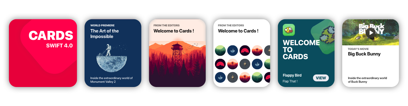
Cards brings to Xcode the card views seen in the new iOS XI Appstore.
Getting Started
Storyboard
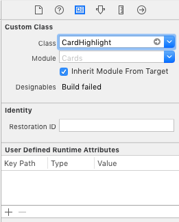
- Go to main.storyboard and add a blank UIView
- Open the Identity Inspector and type 'CardHighlight' the 'class' field
- Make sure you have 'Cards' selected in 'Module' field
- Switch to the Attributes Inspector and configure it as you like.
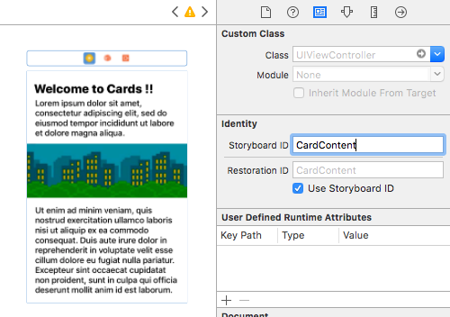
- Drag a blank UIViewController and design its view as you like
- Move to the Identity inspector
- Type 'CardContent' in the StoryboardID field.
Code
import Cards
// Aspect Ratio of 5:6 is preferred
let card = CardHighlight(frame: CGRect(x: 10, y: 30, width: 200 , height: 240))
card.backgroundColor = UIColor(red: 0, green: 94/255, blue: 112/255, alpha: 1)
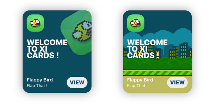
card.icon = UIImage(named: "flappy")
card.title = "Welcome \nto \nCards !"
card.itemTitle = "Flappy Bird"
card.itemSubtitle = "Flap That !"
card.textColor = UIColor.white
card.hasParallax = true
let cardContentVC = storyboard!.instantiateViewController(withIdentifier: "CardContent")
card.shouldPresent(cardContentVC, from: self, fullscreen: false)
view.addSubview(card)
Prerequisites
- Xcode 10.2 or newer
- Swift 5.0
Installation
Cocoapods
use_frameworks!
pod 'Cards'
Manual
- Download the repo
- ⌘C ⌘V the 'Cards' folder in your project
- In your Project's Info go to 'Build Phases'
- Open 'Compile Sources' and add all the files in the folder
Overview
Customization
//Shadow settings
var shadowBlur: CGFloat
var shadowOpacity: Float
var shadowColor: UIColor
var backgroundImage: UIImage?
var backgroundColor: UIColor

var textColor: UIColor  //Color used for the labels
var insets: CGFloat     //Spacing between content and card borders
var cardRadius: CGFloat //Corner radius of the card
var icons: [UIImage]?   //DataSource for CardGroupSliding
var blurEffect: UIBlurEffectStyle //Blur effect of CardGroup
Usage
CardPlayer
let card = CardPlayer(frame: CGRect(x: 40, y: 50, width: 300 , height: 360))
card.textColor = UIColor.black
card.videoSource = URL(string: "http://clips.vorwaerts-gmbh.de/big_buck_bunny.mp4")
card.shouldDisplayPlayer(from: self)    //Required.

card.playerCover = UIImage(named: "mvBackground")!  // Shows while the player is loading
card.playImage = UIImage(named: "CardPlayerPlayIcon")!  // Play button icon

card.isAutoplayEnabled = true
card.shouldRestartVideoWhenPlaybackEnds = true

card.title = "Big Buck Bunny"
card.subtitle = "Inside the extraordinary world of Buck Bunny"
card.category = "today's movie"

view.addSubview(card)
CardGroupSliding
    let icons: [UIImage] = [

        UIImage(named: "grBackground")!,
        UIImage(named: "background")!,
        UIImage(named: "flappy")!,
        UIImage(named: "flBackground")!,
        UIImage(named: "icon")!,
        UIImage(named: "mvBackground")!

    ]   // Data source for CardGroupSliding

    let card = CardGroupSliding(frame: CGRect(x: 40, y: 50, width: 300 , height: 360))
    card.textColor = UIColor.black

    card.icons = icons
    card.iconsSize = 60
    card.iconsRadius = 30

    card.title = "from the editors"
    card.subtitle = "Welcome to XI Cards !"

    view.addSubview(card)
Documentation
See the Wiki, to learn in depth infos about Cards.
GO!
Issues & Feature requests
If you encounter any problems or have any trouble using Cards, feel free to open an issue. I'll answer you as soon as I see it.
New features, or improvements to the framework are welcome (open an issue).
Thanksto
- Patrick Piemonte - providing Player framework used in CardPlayer.swift
- Mac Bellingrath
License
Cards is released under the [MIT License](LICENSE).
*Note that all licence references and agreements mentioned in the Cards XI README section above
are relevant to that project's source code only.