Partition Kit alternatives and similar libraries
Based on the "UI" category.
Alternatively, view Partition Kit alternatives based on common mentions on social networks and blogs.
-
-
-
-
Animated Tab Bar
:octocat: RAMAnimatedTabBarController is a Swift UI module library for adding animation to iOS tabbar items and icons. iOS library made by @Ramotion -
-
-
FSPagerView
FSPagerView is an elegant Screen Slide Library. It is extremely helpful for making Banner View、Product Show、Welcome/Guide Pages、Screen/ViewController Sliders. -
-
JTAppleCalendar
The Unofficial Apple iOS Swift Calendar View. Swift calendar Library. iOS calendar Control. 100% Customizable -
-
Pagemenu
A paging menu controller built from other view controllers placed inside a scroll view (like Spotify, Windows Phone, Instagram) -
-
SwipeCellKit
Swipeable UITableViewCell/UICollectionViewCell based on the stock Mail.app, implemented in Swift. -
SwiftEntryKit
SwiftEntryKit is a presentation library for iOS. It can be used to easily display overlays within your iOS apps. -
ESTabBarController
:octocat: ESTabBarController is a Swift model for customize UI, badge and adding animation to tabbar items. Support lottie! -
Alerts Pickers
Advanced usage of UIAlertController and pickers based on it: Telegram, Contacts, Location, PhotoLibrary, Country, Phone Code, Currency, Date... -
-
Scrollable-GraphView
An adaptive scrollable graph view for iOS to visualise simple discrete datasets. Written in Swift. -
SideMenu
Simple side/slide menu control for iOS, no code necessary! Lots of customization. Add it to your project in 5 minutes or less. -
-
Material Components for iOS
[In maintenance mode] Modular and customizable Material Design UI components for iOS -
NotificationBanner
The easiest way to display highly customizable in app notification banners in iOS -
ActiveLabel
UILabel drop-in replacement supporting Hashtags (#), Mentions (@) and URLs (http://) written in Swift -
SlideMenuControllerSwift
iOS Slide Menu View based on Google+, iQON, Feedly, Ameba iOS app. It is written in pure swift. -
PopupDialog
A simple, customizable popup dialog for iOS written in Swift. Replaces UIAlertController alert style. -
TLYShyNavBar
Unlike all those arrogant UINavigationBar, this one is shy and humble! Easily create auto-scrolling navigation bars! -
StarWars.iOS
This component implements transition animation to crumble view-controller into tiny pieces. -
-
KMNavigationBarTransition
A drop-in universal library helps you to manage the navigation bar styles and makes transition animations smooth between different navigation bar styles while pushing or popping a view controller for all orientations. And you don't need to write any line of code for it, it all happens automatically. -
Whisper
:mega: Whisper is a component that will make the task of display messages and in-app notifications simple. It has three different views inside -
CircleMenu
:octocat: ⭕️ CircleMenu is a simple, elegant UI menu with a circular layout and material design animations. Swift UI library made by @Ramotion -
RazzleDazzle
A simple keyframe-based animation framework for iOS, written in Swift. Perfect for scrolling app intros. -
PaperOnboarding
:octocat: PaperOnboarding is a material design UI slider. Swift UI library by @Ramotion -


WorkOS - The modern identity platform for B2B SaaS


* Code Quality Rankings and insights are calculated and provided by Lumnify.
They vary from L1 to L5 with "L5" being the highest.
Do you think we are missing an alternative of Partition Kit or a related project?

|
InfluxDB - Power Real-Time Data Analytics at Scale
sponsored
www.influxdata.com
|
Popular Comparisons
-
XLPagerTabStripvsPagemenu
-
MXParallaxHeadervsXLPagerTabStrip
-
EurekavsFormer
-
ChartsvsPNChart-Swift
-
folding-cellvsTagListView

|
SaaSHub - Software Alternatives and Reviews
sponsored
www.saashub.com
|
README
Partition Kit
Recently Featured In Top 10 Trending Android and iOS Libraries in October and in 5 iOS libraries to enhance your app!
If you liked this library then you have got to check out my follow up Interact

What is PartitionKit?
- It is the solution to the need for composable and dynamically sized user interface content in SwiftUI.
- also the first piece of software I have ever made into a library so please be gentle(both with use cases and with my heart).
What PartitionKit is not ?
- PartitionKit is not a means to work with an form of stored data, this is not for partitioning hard drives or any other type of formattable data drive.
Requirements
PartitionKit as a default requires the SwiftUI Framework to be operational, as such only these platforms are supported:
- macOS 10.15 or Greater
- iOS 13 or Greater
- tvOS 13 or Greater
- watchOS 6 or Greater
How To Add To Your Project
- Snag that URL from the github repo
- In Xcode -> File -> Swift Packages -> Add Package Dependencies
- Paste the URL Into the box
- Specify the minimum version number (This is new so 1.0.0 and greater will work).
Less Than 2 Minute Tutorial Video
How To Use
Vertical Partition
- Decide on what view you would like to have on
Top, which you would like to have on theBottomand optionally aHandleto be used to drag the partitions to different sizes. - Do This
Swift
VPart(top: {
MyTopView()
}, bottom: {
MyBottomView()
}) {
MyHandle()
}
Horizontal Partition
- Decide on what view you would like to have on
Left, which you would like to have on theRightand optionally aHandleto be used to drag the partitions to different sizes. - Do This
Swift
HPart(left: {
MyLeftView()
}, right: {
MyRightView()
}) {
MyHandle()
}
GridPartition
- Decide on what Views will go in each corner
TopLeft,TopRight,BottomLeft,BottomRightand optionally aHandlefor the user to drag and resize the views with. - Do this
Swift
GridPart(topLeft: {
    MyTopLeftView()
    }, topRight: {
    MyTopRightView()
    }, bottomLeft: {
    MyBottomLeftView()
    }, bottomRight: {
    MyBottomRightView()
    }) {
    MyHandle()
}
Examples
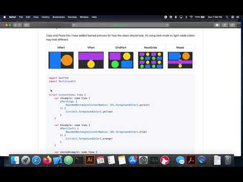
Copy and Paste this I have added Named pictures for how the views should look, Im using dark mode so light mode colors may look different.
| HPart | VPart | GridPart | NestGrids | Mixed |
|---|---|---|---|---|
 |
 |
 |
 |
 |
import SwiftUI
import PartitionKit


struct ContentView: View {
    var vExample: some View {
        VPart(top: {
            RoundedRectangle(cornerRadius: 25).foregroundColor(.purple)
        }) {
            Circle().foregroundColor(.yellow)
        }
    }

    var hExample: some View {
        HPart(left: {
            RoundedRectangle(cornerRadius: 10).foregroundColor(.blue)
        }) {
            Circle().foregroundColor(.orange)
        }
    }

    var nestedExample: some View {
        VPart(top: {
            hExample
        }) {
            vExample
        }
    }

    var gridExample: some View {
        GridPart(topLeft: {
            RoundedRectangle(cornerRadius: 25).foregroundColor(.purple)
        }, topRight: {
            Circle().foregroundColor(.yellow)
        }, bottomLeft: {
            Circle().foregroundColor(.green)
        }) {
            RoundedRectangle(cornerRadius: 25).foregroundColor(.blue)
        }
    }

    var nestedGridsExample: some View {
        GridPart(topLeft: {
            gridExample
        }, topRight: {
            gridExample
        }, bottomLeft: {
            gridExample
        }) {
            gridExample
        }
    }

    var body: some View {
        nestedExample

    }
}


struct ContentView_Previews: PreviewProvider {
    static var previews: some View {
        ContentView()
    }
}
Todo
- Add in constraints so that partitions will not cause negative frame values that invert the views when the handle is dragged beyond the frame of the container
- Add more customizability to initial layouts
- Add a
ListStyle grid collection layout that can be initiated with a list of Identifiable data elements. - General cleanup, some stuff was not meant to be left in, i will find it at some point.