Description
UIButton subclass with animated, state-aware attributes. Easy to subclass and configure! Full API docs
SimpleButton alternatives and similar libraries
Based on the "Button" category.
Alternatively, view SimpleButton alternatives based on common mentions on social networks and blogs.
-
LGButton
A fully customisable subclass of the native UIControl which allows you to create beautiful buttons without writing any line of code. -
-
PMSuperButton
🔥 PMSuperButton is a powerful UIButton coming from the countryside, but with super powers! 😎 -
-
AHDownloadButton
Customizable download button with progress and transition animations. It is based on Apple's App Store download button. -
NFDownloadButton
Revamped Download Button. It's kinda a reverse engineering of Netflix's app download button. -
DesignableButton
A Custom UIButton with Centralised Styling and common styles available in Interface Builder -
AnimatablePlayButton
Animated Play and Pause Button written in Swift, using CALayer, CAKeyframeAnimation. -
IGStoryButtonKit
IGStoryButtonKit provides an easy-to-use button with rich animation and multiple way inspired by instagram story/stories. -
NxEnabled
Library that allows you binding `enabled` property of button with textable elements (TextView, TextField)
WorkOS - The modern identity platform for B2B SaaS


* Code Quality Rankings and insights are calculated and provided by Lumnify.
They vary from L1 to L5 with "L5" being the highest.
Do you think we are missing an alternative of SimpleButton or a related project?


README
SimpleButton

UIButton subclass with animated, state-aware attributes. Easy to subclass and configure! Full API docs
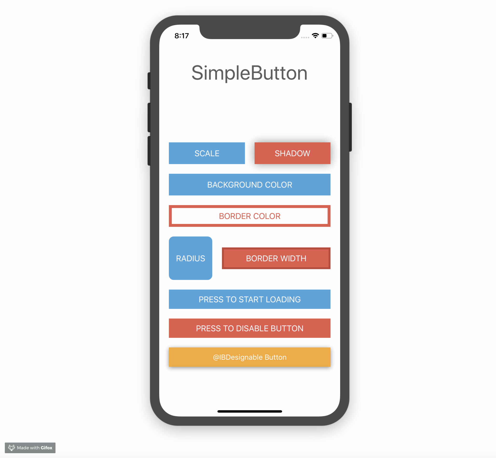
Usage
Just create your own SimpleButton subclass and configure your button attributes by overriding configureButtonStyles.
class PrimaryButton: SimpleButton {
    override func configureButtonStyles() {
        super.configureButtonStyles()
        setBorderWidth(4.0, for: .normal)
        setBackgroundColor(UIColor(red: 52/255, green: 73/255, blue: 94/255, alpha: 1.0), for: .normal)
        setBackgroundColor(UIColor(red: 44/255, green: 62/255, blue: 80/255, alpha: 1.0), for: .highlighted)
        setBorderColor(UIColor(red: 44/255, green: 62/255, blue: 80/255, alpha: 1.0), for: .normal)
        setScale(0.98, for: .highlighted)
        setTitleColor(UIColor.whiteColor(), for: .normal)
    }
}
For usage in Interfacebuilder, just use your SimpleButton subclass as custom class for any UIButton element. All defined styles gets applied automatically.
You can also configure your button without a subclass directly inline.
let awesomeButton = SimpleButton(type: .custom)
awesomeButton.setBorderWidth(2.0, for: .normal)
awesomeButton.setBorderColor(UIColor.redColor(), for: .highlighted)
view.addSubview(awesomeButton)
Note that you should use UIButtonType.custom to avoid undesired effects.
Please checkout the example project for a detailed usage demo.
@IBDesignable
Have a look on [DesignableButton](Example/DesignableButton.swift) subclass within the Example Project for @IBDesignable usage.
Animation
Each state change of SimpleButton animates by default. Sometimes you need to define which state transition should animate and which should happen immediately. Therefore you can control that behaviour with the animated and animationDuration parameters.
setBorderWidth(4.0, for: .normal, animated: true, animationDuration: 0.2)
setBorderWidth(8.0, for: .highlighted, animated: false)
This means, every state change to .normal animates the borderWidth to 4.0.
Every state change to .highlighted changes instantly the borderWidth to 8.0 without animation.
Loading state
SimpleButton has a custom loading state. You can toggle this state by setting simpleButton.isLoading. The button shows an UIActivityIndicator instead of the title when adding the loading state.
simpleButton.setCornerRadius(20, for: SimpleButtonControlState.loading)
simpleButton.isLoading = true
If you don´t like the default loading indicator, you can set your own UIView by doing
simpleButton.loadingView = CustomAwesomeLoadingView()
Please note, when using a custom loading view don´t forget to handle the position and initial add to subview by yourself to fit your needs.
Configurable attributes
Take a look at the Setter for state attributes section of the API Docs
Installation
Note that SimpleButton is written in swift 5 and may not be compatible with previous versions of swift.
Swift Package Manager (Recommended)
Add the following dependency to your Package.swift file:
.package(url: "https://github.com/allaboutapps/SimpleButton.git", from: "5.0.0")
Carthage
Add the following line to your Cartfile.
github "allaboutapps/SimpleButton" ~> 5.0
Then run carthage update.
Manually
Just drag and drop the SimpleButton.swift file into your project.
Contributing
- Create something awesome, make the code better, add some functionality, whatever (this is the hardest part).
- Fork it
- Create new branch to make your changes
- Commit all your changes to your branch
- Submit a pull request